Best Adsense Ad Locations & Ad Formats To Earn Handsome Revenue

everyone is well aware that adsense really pays! But most people are still disappointed with their adsense revenue despite working hard in writing good content. I had the same feeling but as time passed I became more and more familiar at how Adsense payment mechanism works. Those who think they are smarter than the Adsense Engineers often end in frustration upon deactivation of their adsense accounts. Kindly prefer fair earning and give preference towards writing good content and attracting more and more readers. The true income lies in the number of visitors to your blog. Clicks, Page Impressions will increase once you make a good start with adsense. By good start I mean choosing smart locations on your layout to encourage Clicks and boost up your daily page Impressions.
Note:-1000 Page Impressions can return $0.5-$1. Depends on type of Ad.
While deciding an Ad Position Always Ask your selves these questions:-
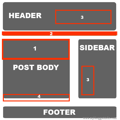
By experimenting with certain Ad positions on our blog and by studying various adsense articles we can now confidently claim the best Ad spots for Blogspot and Wordpress blogs. Observe carefully our Monetized Sample Blog Layout below,

Every Blog has four main sections i.e
- The Header:- where we display blog title, description and navigation menu.
- Post Body:- where we write content
- Sidebar:- where we display widgets
- Footer:- where we display credits or widgets
We have numbered the best Ad Locations from #1 (best) to #4 (Least Best). The reasons for each location are explained below.
Location #1:-Displaying Adsense Advertisements Below Post Titles
This is the best position to display your ads. We have observed that our blog earning increased tremendously when we decided to display ads below post titles. In fact this is the only spot which is first sight of attraction for every reader.
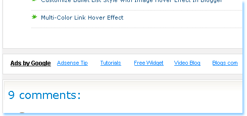
You can observe that I have displayed no ads below post titles on my homepage but when you enter a specific page the Ad below post title appears. Like this,

This way we keep our layout clean and revenue green :) I will write a detailed post tomorrow on how to add adsense code below post titles, below post body and under navigation menu.
The Ad formats below will return really impressive results for Ads displayed below post titles.
Best Ad Formats:-
- Banner (468 x 60) Or
- Square (250 x 250) Or
- Medium Rectangle (300 x 250)
Location #2:- Displaying Advertisements Above Navigation Menu
Now this location is the second best position which is the favourite Ad spot choice for many professional bloggers. The reasons are simple. Firstly because this area is of greatest interest to visitors and secondly because Ads in this area look clean and uncluttered so it won’t annoy the readers at all!

This area will have the highest page Impressions because it appears every where from homepage to archives and individual post pages!
Tutorial on how to add adsense above navigation menu will be shared tomorrow.
Best Ad Formats:-
- (728x15) Displays up to 5 links OR
- (728x15_4) Displays up to 4 links
Location #3:- Displaying Advertisements At Right Side Of Header Or On Sidebars

These two locations have their own importance and according to our experiments we have obtained equal results from both these areas. These two areas give the highest page impressions. Again for the same reason that they appear everywhere, may that be your homepage, archive pages or post pages.

Displaying a skyscraper at the sidebar can result in tremendous clicks. A skyscraper if customized well enough can appear just like a part of your blog links. The ads appearing in skyscraper are very tempting, interesting and attractive at the same time. A well displayed and clean skyscraper will always attract a visitor to find the right answer to his query.
Best Ad Formats:-
- For Header Right Choose Banner (468 x 60)
- For Sidebar choose Skyscraper (120x600) or Wide Skyscraper (160x600)
Location #4:- Displaying Advertisements Below Posts

We gave this area the least importance firstly because the bottom of post is only reached when a reader really enjoys reading your article. Most often readers are in a surfing mood so they would not notice the footer at all. But still we can’t underestimate this area and can expect to get good relevant clicks by displaying the correct ad format as mentioned below.
Best Ad Formats:-
- Banner (468 x 60) or
- (468x15) Displays up to 5 links
A word Of Advise
Flow of Income from Adsense Requires patience and immense hard work. Give at least up to 1-2 years for income to flow positively. Give more importance to your blog interface and to your content. A good blog content with unfair user interface is equal to an unsuccessful one. Write quality and unique posts. Buy a custom domain and work harder and harder. Don’t try short cuts by making fraud clicks because one can never beat the extra efficient engineers of adsense. If your adsense account is banned for some reasons, your entire blogging career will end in frustration. Think again!
Patience and hard work brings fruitful results.
I wish you have a nice blogging experience by monetizing your blog wisely and smartly.
Best Adsense Ad Locations & Ad Formats To Earn Handsome Revenue
 Reviewed by Superuser
on
March 14, 2018
Rating:
 Reviewed by Superuser
on
March 14, 2018
Rating:

No comments: